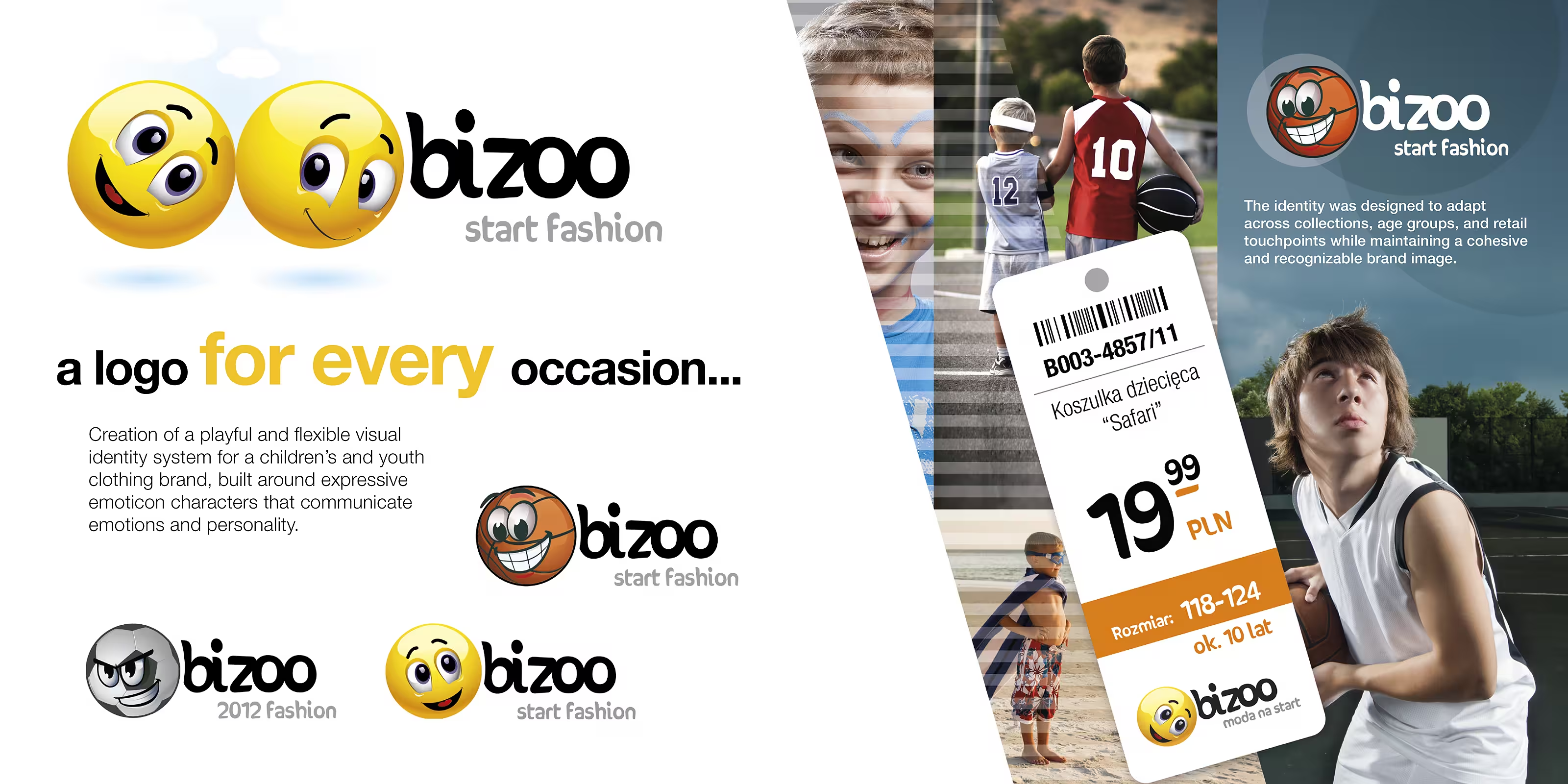
Bizoo Kids Clothing

New Brand Design & Development
A Brand That Is Never the Same Twice
The Brief
A group operating several children’s clothing brands asked NEXT Design to create a completely new kids’ fashion brand from the ground up. Our answer was an identity that is never boring and never identical – one that keeps changing, yet always remains coherent and recognisable.
Emoticons as a Living Logo
The Concept
In the early days of smartphones, before emoji had become part of everyday language, we proposed building the brand around a series of expressive, three-dimensional emoticons. The logo symbol is an emoticon – one or several – that never looks the same: each takes on a different emotion, facial expression and form. The idea speaks directly to children and mirrors the way they experience the world, emotion first, while a clear set of rules keeps every variation unmistakably part of one brand. The name itself is a play on words: “Bizoo” echoes a phonetic Polish spelling of the French bisou – a kiss.
From Concept to Photography
Our Role
NEXT Design developed the brand concept, the complete visual identity and all the photoshoots for the project. Taking responsibility for both the brand system and the imagery meant the emotion-driven idea carried through consistently, from the logo to the product photography that introduced the collection to the market.
More From the Archive
Three more projects drawn at random from over 25 years of our work. Each shows a different side of how function, form and content come together. Keep exploring, or browse the complete Works Archive.
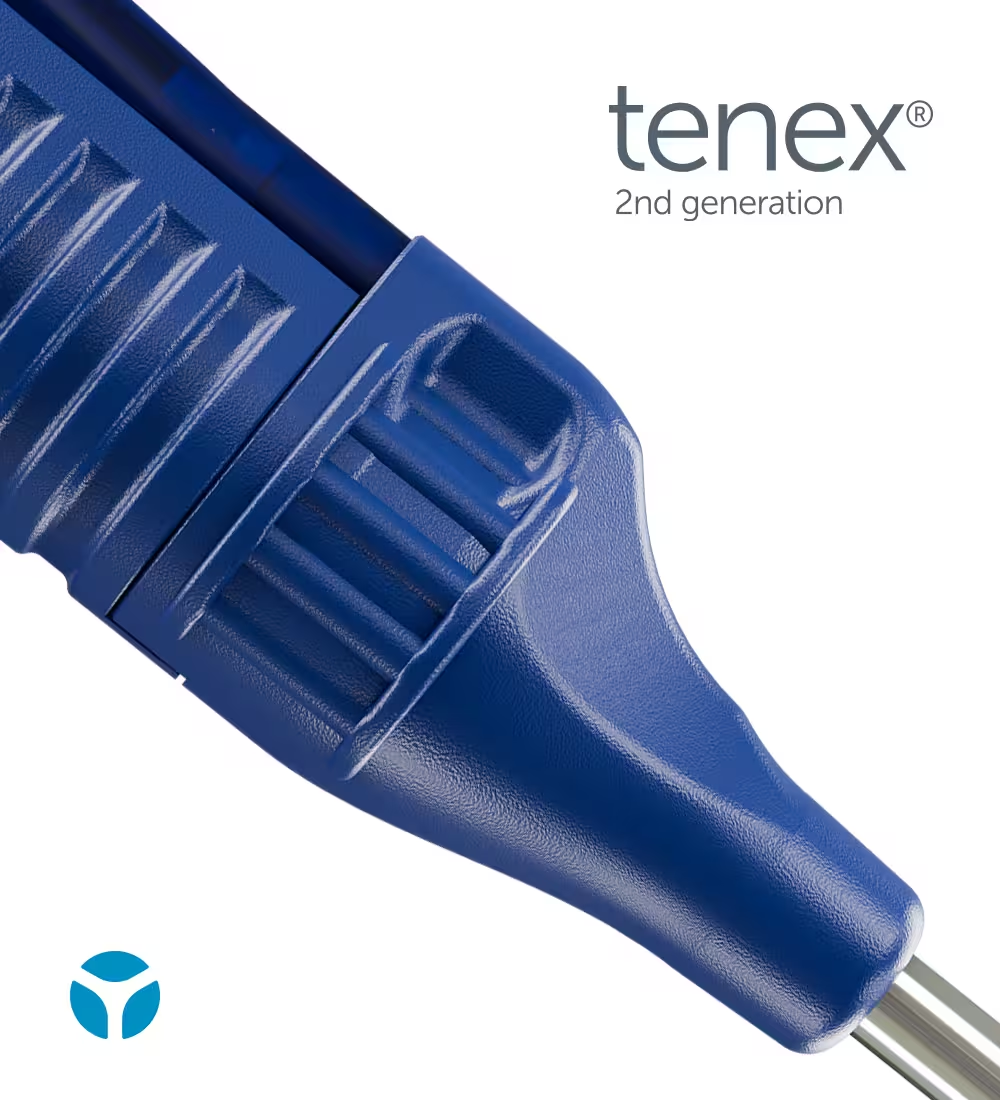
Tenex 2nd Gen Product Launch Campaign

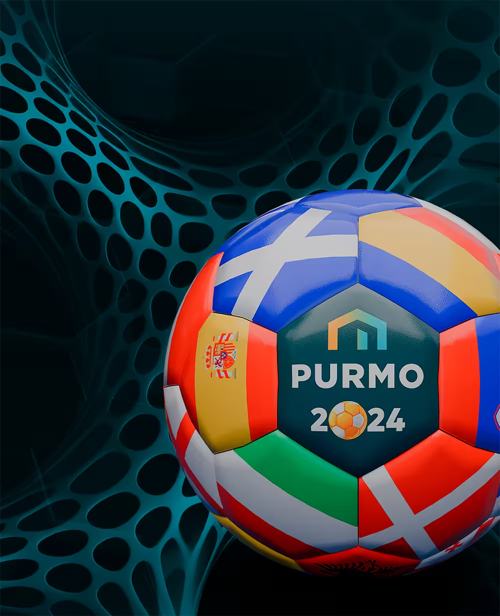
Purmo'24 Soccer Betting Game Website

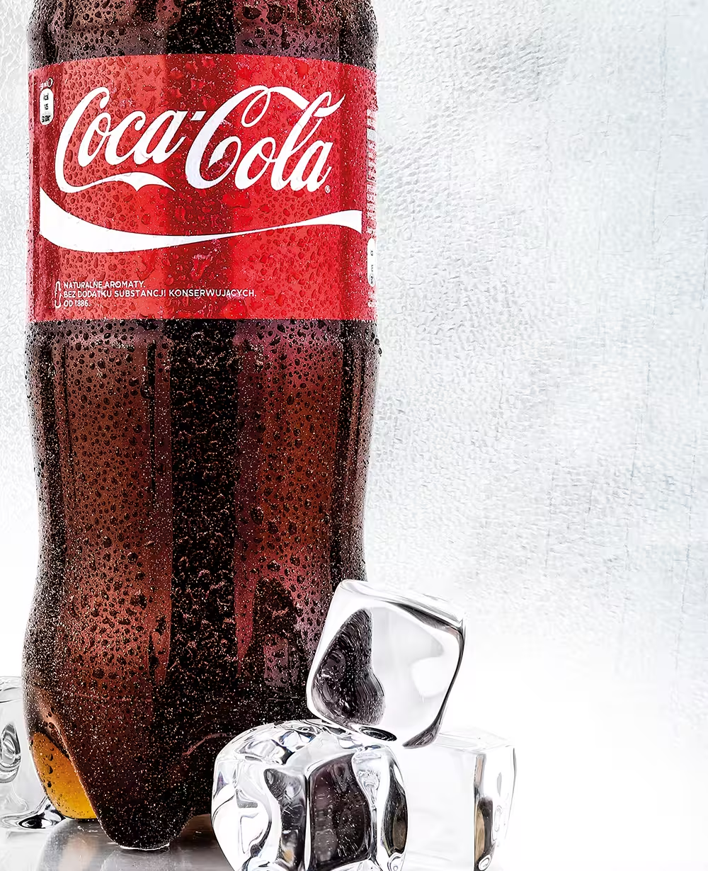
Coca-Cola Product Imaging
